MCobro
Simplifying Finances for Doctors
Introduction / Context
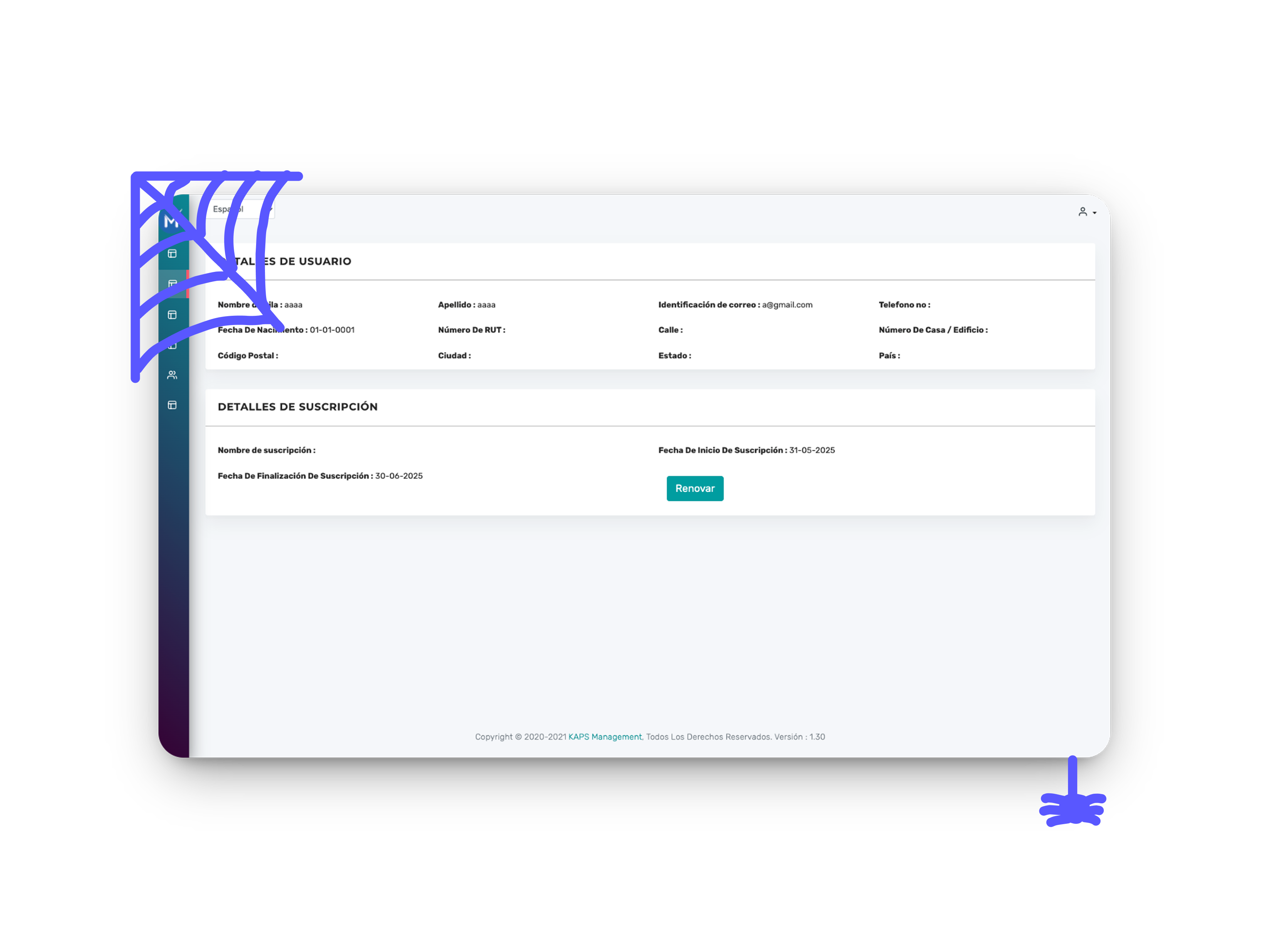
MCobro is a financial app designed specifically for doctors in Uruguay. The previous version was, honestly, a bit of a headache: slow, overwhelming, and frustrating to use.
“Users felt lost and overwhelmed by how clunky the old app was.”
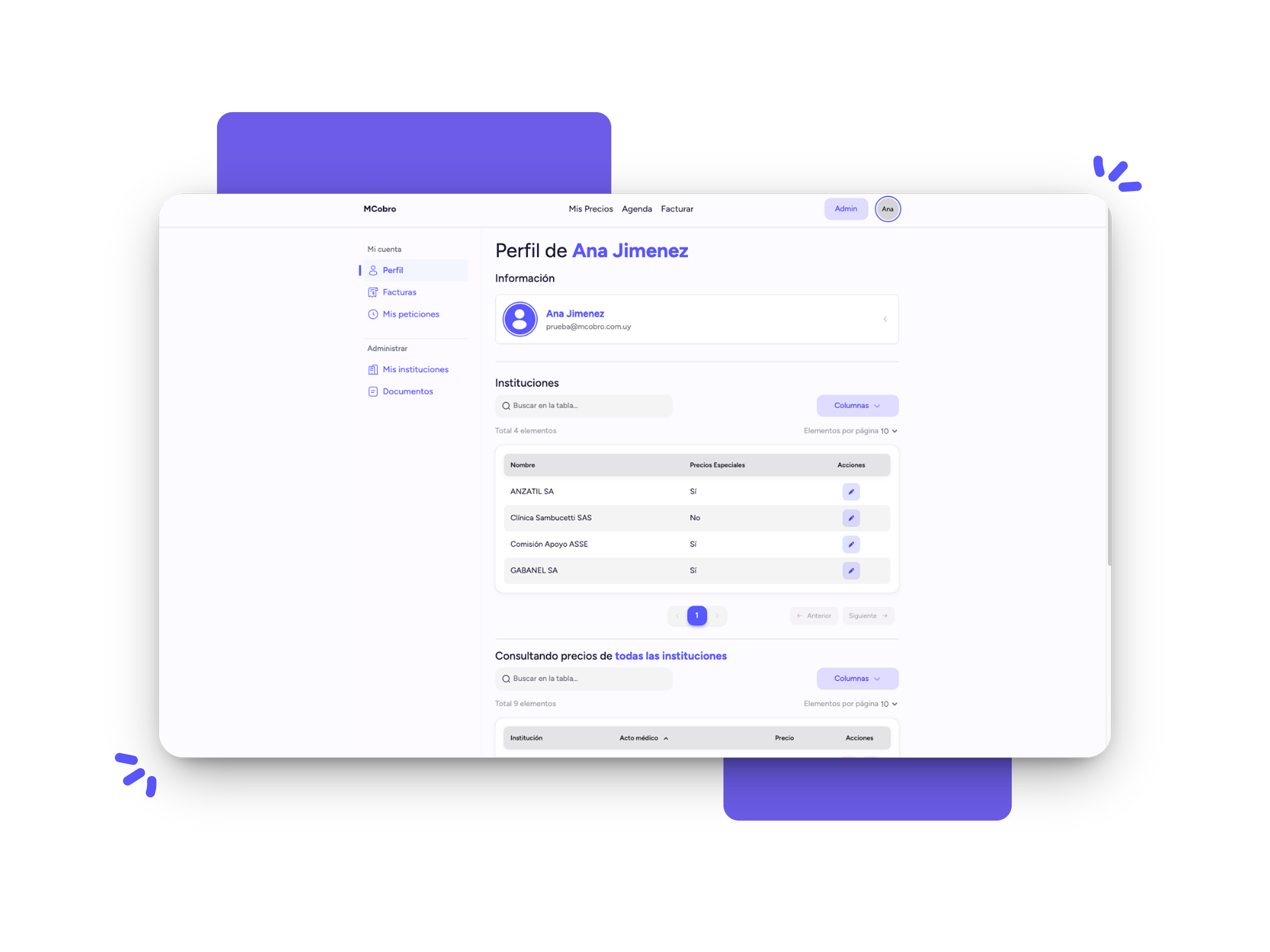
Our goal with this rebrand? Make it fast, reliable, and intuitive — a tool doctors actually want to use.

My Role & Tools
I wore a few hats on this one:
- UX/UI design
- Frontend development
- Some backend work
- Branding refresh
Tech-wise, I leaned on:
- Next.js & TypeScript
- Node.js
- TailwindCSS
- Drizzle (for database stuff)
The Process
We saw a clear problem: users were dropping off. Very few were logging in, and many stopped altogether. So, what did we do?
- Simplified inputs: Reduced the info doctors have to type in.
- Automated processes: Made the app do more work behind the scenes.
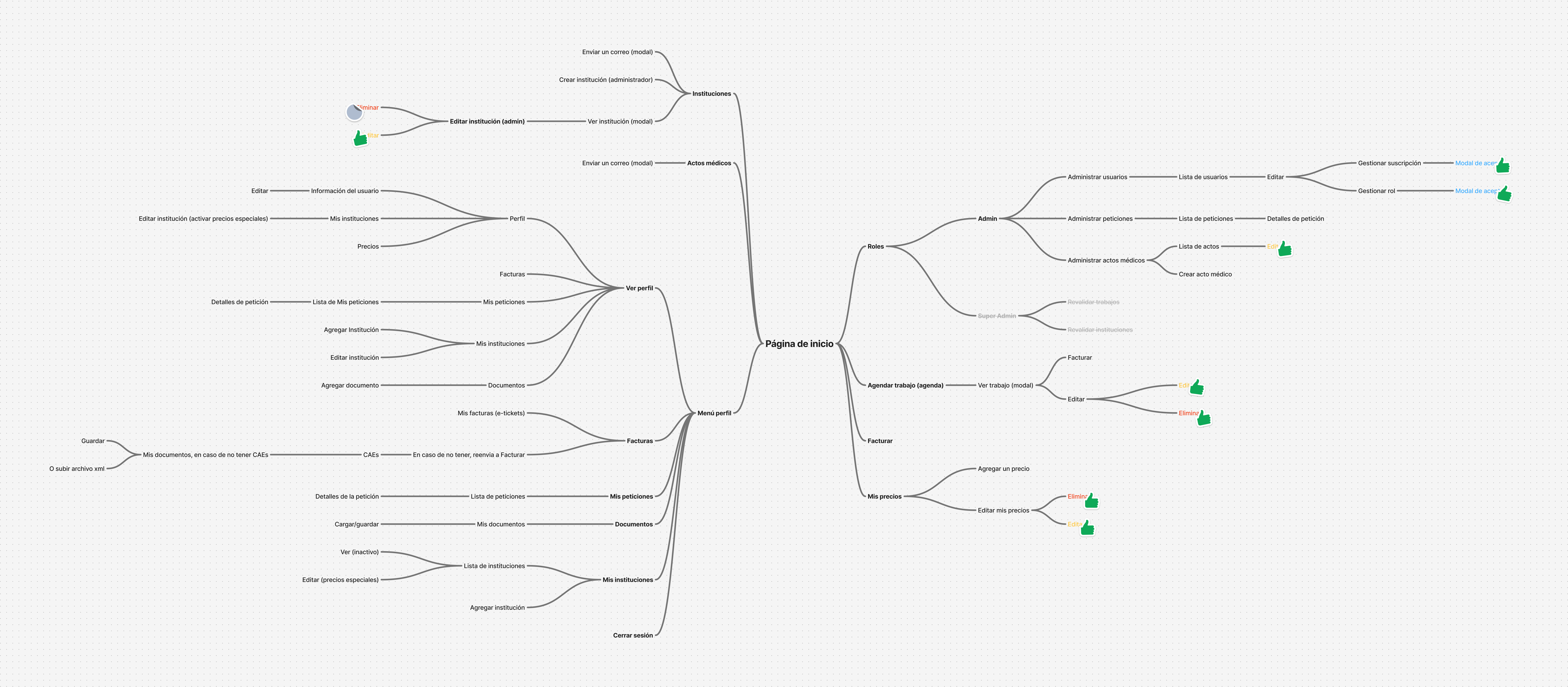
- Step-by-step UI: Created an interface that guides users, instead of confusing them.
“It’s like holding the user’s hand through each step — no guessing needed.”
We tested ideas repeatedly with real users, tweaking things as we went.

Results
Performance skyrocketed. Thanks to optimizing images and cutting down data, loading times dropped dramatically.
“It feels like night and day compared to before.”
The project is still evolving, but early feedback has been very positive. We now have a solid, stable version that’s much easier — and honestly, more enjoyable — to use.

Lessons Learned
Navigating Uruguay’s legal billing requirements (DGI) was challenging, but eye-opening.
“Simplifying complex, legal-heavy processes visually is a game-changer for user adoption.”
Also, constant user feedback and gently guiding people through the app made a huge difference.
If you’re curious to see more projects or just want to chat, feel free to explore the rest of my portfolio or reach out!